YOUTUBE'S ANDROID APP REDESIGN: A GLITTERY MESS OR A SPARKLING CHANGE?
YOUTUBE'S ANDROID APP REDESIGN: A GLITTERY MESS OR A SPARKLING CHANGE?
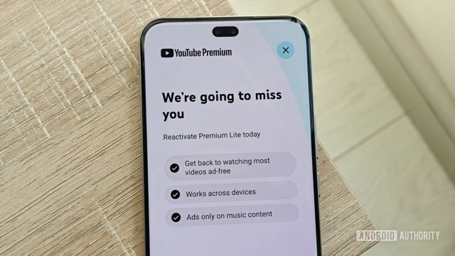
OH MY GOSH, YOU GUYS! 🎉 So, it looks like YouTube just dropped a major redesign for its Android app, and the reactions are as dramatic as a scene kid's hair! 💖✨ They decided to shake things up by focusing more on Custom Feeds and giving a big ol' goodbye to the Subscriptions tab at the bottom. Like, WHAT? Who even thought that was a good idea?! 🤯
From what I gathered, the update is all about SHORTS (no, not the fashion kind 😜) and trying to make video browsing more personalized. But hold your sparkles, because the NEW SUBS tab doesn’t even have Filters! Can you believe it? Filters were like, the magical wand that helped us find all our fave content! Now, it seems like they just poofed into thin air. 🪄✨
So, I was like, “Let’s see what the people think!” and guess what? A whopping 92% of over 1,200 voters are NOT feeling this redesign AT ALL! They want the Subscriptions tab BACK, thank you very much! 🙅♀️💔 It feels like YouTube just took away our favorite glittery accessory and replaced it with something dull and boring! UGH!
Some users commented that they’re not too bothered since they don’t really use YouTube on their phones, but honestly, that’s like saying you don’t care that you lost your favorite pair of glittery sneakers! 💔👟 A tiny 5% said they’re okay with the update, but it looks like most people are ready to fight for the return of the beloved Subscriptions tab! 💪✨
So, what do YOU think? Should YouTube just wave its magic wand and change things back? Or do you have some sparkly ideas to make the redesign better? LET ME KNOW in the comments below! 🌟💬
💬 Comments
Log in to join the conversation.
No comments yet.