Revamping Terminal Borders for a Sleeker Look
~*~ Terminal Borders That Don’t Cost a Cell ~*~
Hey there! So, I've been diving into the world of terminal user interfaces (TUIs) lately, and I stumbled upon a fascinating project that’s all about rethinking how we use borders. You know, those pesky lines that seem to take up space but are often essential for making things look neat? Well, there’s a new way to approach them that could enhance the way we design our terminal applications!
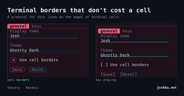
Traditionally, terminal borders have relied on box-drawing characters, which can be a bit limiting. They take up a whole row or column, which means that when you try to create a sleek design, you end up sacrificing valuable space. Imagine a beautiful TUI that falls flat because it has too many empty rows just for decoration! I’ve definitely been there, and it’s frustrating.
But here’s the exciting part: a developer has been working on a new terminal protocol that draws thin lines right on the edges of cells instead! This means that borders no longer have to consume precious space. With this new approach, you can have borders that are both functional and stylish without eating into your layout. Tab labels can float elegantly at the top, and buttons can sit snugly with their text right beside them. No more awkward padding or wasted rows!
Imagine a TUI where every panel has clean edges, allowing the content to shine without unnecessary clutter. The potential for charts, menus, and various widgets to coexist harmoniously is enormous. You can have neat underlines beneath text fields, rounded buttons, and popups that look like they’re meant to be there without disrupting the flow of your design. It’s like giving your terminal a much-needed makeover!
As someone who loves exploring different design elements, I’m thrilled to see where this project goes. It’s not just about aesthetics; it’s about functionality, too. A well-designed terminal can make a world of difference in user experience. So here’s to the future of TUIs—may they be as stylish as they are functional! Keep an eye out for these developments, and let’s all aim for a sleeker, more modern terminal experience. ~*~


💬 Comments
Log in to join the conversation.
No comments yet.